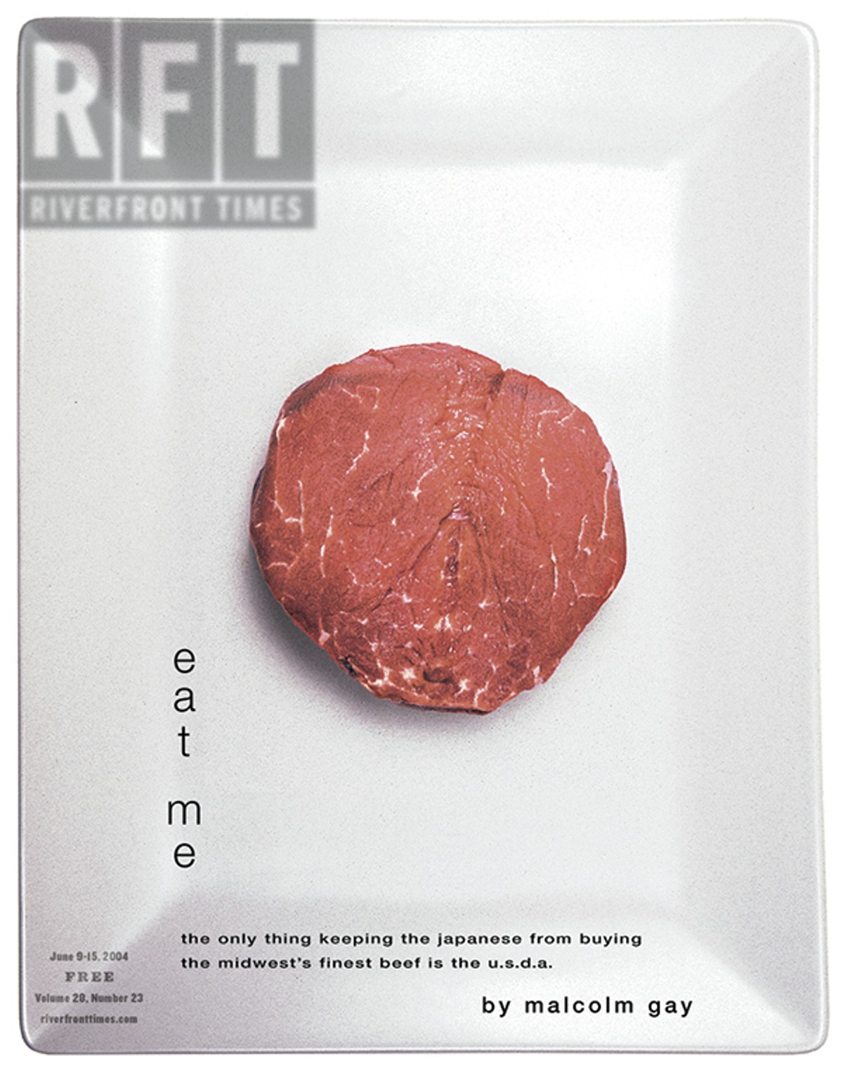
We'd just published a story about how the USDA killed a local beef co-op's deal to export top-quality meat to Japan.
The article would go on to win its author a James Beard Award — a serious national score for a writer at a Midwestern alt-weekly. But the cover was getting a less-favorable reception from Riverfront Times readers who were convinced that we'd foisted a subliminal obscenity on them.
As covers go, it was stark: a photo of a disk of raw red meat centered on a white ceramic plate. The RFT logo at the upper left looked like part of the platter's glaze. The type treatment was in every way minimalist.
The headline: "Eat Me."
I liked the cover. It had, after all, been my idea, from the headline to the filet mignon right down to the platter, which came from my kitchen at home. To my eye, it was a striking visual whose sole (brilliant!) subtlety resided in the fact that if you rotated the image 90 degrees and squinted, it kind of looked like the Japanese flag.
Our readers were more discerning. Where I pictured the Land of the Rising Sun, they saw a...vagina.
This was disconcerting.
It's one thing to challenge one's audience with confrontational imagery. A self-immolating monk, say, or a gay Ernie and Bert. (Or, to cite one of many RFT instances, 57 naked women forming a human peace sign.) In such cases, you expect a little blowback. But for crying out loud, we hadn't done anything!
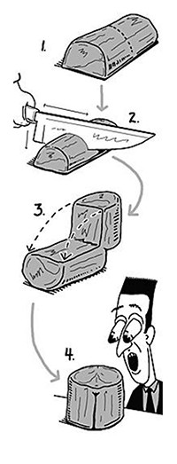
Unlike all the other art directors I've ever met, RFT's Tom Carlson has a way with words. So it was that when I complained to him about the injustice ("Sometimes a hunk of meat is just a hunk of meat!"), he shot back: "MeatGina™!"
The following week, we published our very first art director's note, accompanied by the cartoon drawing below.
When the MeatGina™ fracas broke out in the summer of 2004, I'd been at RFT a little more than a year. Tom Carlson had been at the paper for twenty years.
St. Louis was a homecoming for me. I did most of my growing up in U. City, less than half a mile from the RFT office in the Delmar Loop, but I'd moved away for good — or so I'd thought — in the mid-1980s. I'd since stumbled into a career in alternative journalism, spending nine years in Miami and five in the Twin Cities.
My goal at Riverfront Times was to provide coverage that reflected the diverse culture of the area, in a thought-provoking way that St. Louisans would engage with (if not always agree with).
By that time, our contents had migrated online — which is to say, pretty much everything that went to press each week was simultaneously published at riverfronttimes.com. In the years that followed, the balance would tilt further and further to the internet, to the point where most stories would appear online as soon as they were ready for publication, and the advertising base for the hard-copy edition couldn't support enough pages to fit all that stuff.
But in 2004, print and online were essentially created equal.
Except for the cover.
To this day, there's no online equivalent to a magazine cover. The opportunity for visual impact is and always has been enormous. And I felt it was crucial for RFT to take full advantage. There's a lot working against top-shelf cover design at a weekly, though. Money is tight, and so are deadlines. (Think about it: The art director has to conceive and execute 52 covers a year.)
And then there's the editor.
When it comes to designing covers, editors stink. This stands to reason — an editor's job, after all, is to edit stories. Editors are word people. Art directors are picture people. Yet most editors love coming up with cover concepts and are entirely oblivious to how ill-suited they are to the task.
A great cover image ought to convey something essential about the story it's trying to sell. But at an alt-weekly, the subject matter is often complex, and the narrative usually doesn't have an instantly recognizable (or exceedingly photogenic) protagonist.
Right now, maybe, you're imagining a sleek, tidy office in which our hero is hitting "send" on an email to his art director, enclosing a story that's all set to be laid out, headline treatments and all.
That might be somebody's office, but it was never mine. At an alt-weekly, the art director almost always must begin designing the cover long before the story is in a publishable state.
Of all the people involved in the process, the editor is in the best position to envision what the work-in-progress will look like when it's finished. So it's only right that they should have a seat at the drawing board. As long as it's a back seat.
Still, some editors want nothing to do with cover design. That might make for an undemanding working relationship in a good-fences-make-good-neighbors sort of way, but I don't think it yields better covers.
But I digress.
Not long after the MeatGina™, Carlson and I hit on a strategy — and, not coincidentally, a vocabulary — that led to a breakthrough in the way he designed the cover each week.
Here's why: The "Eat Me" cover embodied the aesthetic I'd been pushing. The trouble was, I'm a word person (mostly, anyway) and he's a picture person (mostly, anyway). So while we'd throw around notions like "strong central image," and "simple" and "elegant," and sometimes we'd even share illustrations that we liked, we weren't on the same page.
I have an unfortunate knack for brainstorming ideas for cover images that can't be translated into a physical reality on the page. When I dream up a concept, I lack the apparatus to judge whether it is, for lack of a better term, illustratively possible.
This is a serious limitation.
Carlson, on the other hand, can grasp the visual potential intuitively. He is the most literate art director I've ever met. When an editor hands over a story draft, he reads it. (Not nearly as common a phenomenon as you might think.) He also comes up with some of the best headlines of anyone I know — a rare talent all on its own.
The first epiphany we shared was that a cover image should not require any type in order to convey its message. That's not to say that a cover shouldn't have any words on it. The job of the words is to pick up where the image leaves off.
To commit to this notion, I made Carlson two promises:
1) No more "teases" on the cover. (You're familiar with the blurbs for ancillary stories that clutter most magazine covers.) Carlson hated them. I liked the idea of doing away with them, because they're the enemy of simplicity.
Which led to...
2) If Carlson could design a cover that needed no words to sell the story, we would put no words on it. In fact, this was to become a grail of sorts for him. And he made a few such covers, and they went to press as he intended, with no words on them. That said, an image that says it all isn't necessarily the best design for every story.
The second epiphany was the realization that as distinct elements of communication, stories and covers are analogous to grammatical parts of speech: A story is a verb, while a cover is a noun.
This was huge.
For one thing, it accounts for why editors make such bad art directors: They always attempt to convey the narrative arc of the story. This truth had been imparted to me years earlier at the annual convention hosted by the Association of Alternative Newsweeklies, where SF Weekly editor John Mecklin and his art director teamed up for a presentation about cover design. Mecklin drew a crude sketch of a big cowboy boot filled with money, stomping on a little guy. This, he explained, is the narrative of every alt-weekly cover story.
Better yet, the grammatical dichotomy served as a heads-up when we veered off the rails. If the image on the cover needed to be described in terms of an action, we needed to take a step back.
And best of all, it led to an intermittent series of covers that mimicked actual physical objects: A 40-ounce beer bottle. A board game. A takeout container from a Chinese restaurant.
When RFT's corporate parent moved me to New York in 2013, I wanted Carlson to come too. It made a lot of sense: The Village Voice, where I was headed, was clunking along without an art director. But alt-weeklies — hell, all species of journalism — were clunking along without a sustainable business model. So I went, and Carlson stayed, until our bosses transferred him to Phoenix when they sold the Riverfront Times in 2015. (To bring the story full circle, he's back now, working for RFT's new owners in a corporate role.) As it turned out, money was in such short supply that for the two and a half years I ran the Voice before my bosses sold it, too, he designed nearly all of the covers.
Like most long-distance relationships, it wasn't as much fun, but by that time, nothing was.
"Eat Me" wasn't the best idea I ever had, and it's a drag when people mistake your filet for genitalia, but I remember it fondly. And looking at it now, I still think it's a pretty good concept. (For an editor.)
More to the point, it ignited a conversation that continued for a decade and then some — a period that saw Tom Carlson create some of the best work to appear on the cover of any print publication, anywhere. This he accomplished in a medium that relies on cheap newsprint, as opposed to the coated stock that glossy magazines use.
And that, boys and girls, is how my MeatGina™ changed everything.
Now that I've put this into words, I'm afraid it might seem like I'm trying to take the credit for it. But that's because these are just words. Take a look at the covers that follow. Because we all know what they say about how many words one picture's worth.


Tom Finkel, who was editor in chief of the Riverfront Times from 2003 to 2013, now lives in the other Maplewood, which is in New Jersey.