image via Strava
The heatmap was built by San Francisco-based startup Strava, which tracks activity for its "global network for athletes" via satellite navigation. Now that the company has compiled a staggering 17 billion miles of data from its users, patterns have emerged, including bike paths, parks and even popular off-road spots, like ski slopes in the Rockies and the swim leg of the Ironman World Championships just off the coast of Hawaii.
Here in St. Louis, all the activity that's taken place in Forest Park and Tower Grove Park makes those our hottest spots. You can even break out the map to show only foot traffic, as opposed to both cycling and jogging, like we did below — revealing the many, many footsteps trod through the city's two most-used parks:
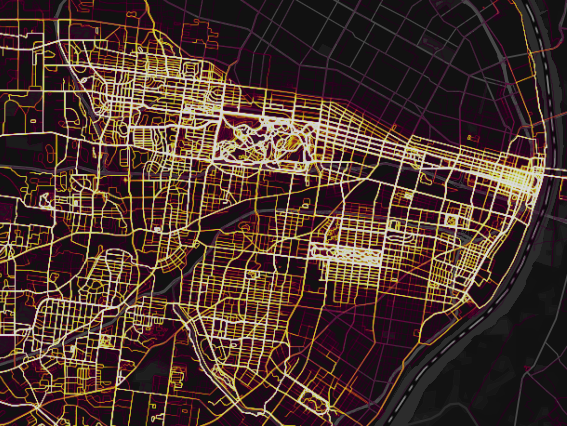
image via Strava
Now, it's not that other cities don't have their hotspots — and very, very coldspots. Looking at Los Angeles, for example, you can see a lot of activity on the wealthy west side of town, and significantly less utilized areas in south LA. Of course the kind of affluent athletes who use this technology are going to be more likely to live (and train) in Santa Monica than Compton.
But what makes our St. Louis map fascinating is how stark it is. Delmar might as well be a wall, with North Kingshighway the only ingress and egress for cyclists on a journey.
That said, there is one exception, a well-worn loop in north city just south of I-70. You can see it in context in the very first map above, and in a closer view below:
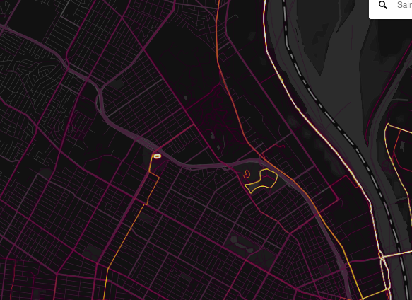
image via Strava

image via Google Maps
We welcome tips and feedback. Email the author at [email protected]