Should we put an exclamation mark after that? As in, "The flu epidemic is here!" Last month we only had Christmas to dread. But now you can look forward to a week in bed, in acute misery. The Center for Disease Control has declared it so.
In case you're curious, Google has prepared a map of the spread of flu across the country. It's not a very exciting map, since 44 of the 50 states have been colored bright red, for "intense." The remaining six are merely orange, for "high." (But which will fall to "intense" next? Our bet is on South Dakota, which is surrounded on all sides.)
Nationally, this appears to be the biggest flu epidemic in the past six years. Missouri is consistent with the national trend (aside from being blessed with an unusual spike in the fall of 2009.)
But how does Google know how many people have the flu? Is it foolish to ask, since Google knows everything?
Well, uh, actually... Google is only measuring the number of searches for information about the flu. The epidemic part comes from the assumption that you would only bother to search for information about the flu if you or someone close to you is experiencing flu-like symptoms.
A disclaimer on the site, though, says that Google's model has been consistent with "historic flu activity data."
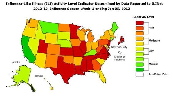
The CDC's map, though, shows that maybe half the states have reported high levels of flu activity. Unfortunately, Missouri is among them. There are already way more cases reported this season than in previous years -- and we still have a month to go before the height of the season.
In other words, if you haven't already, maybe it's time to go get a flu shot. And stock up on chicken soup.